BRUSH
Public Art and Design by Brian W. Brush
Filament Mind (2013)
Teton County Library, Jackson, Wyoming with Yong Ju Lee and Noa Younse
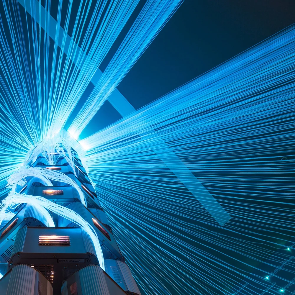
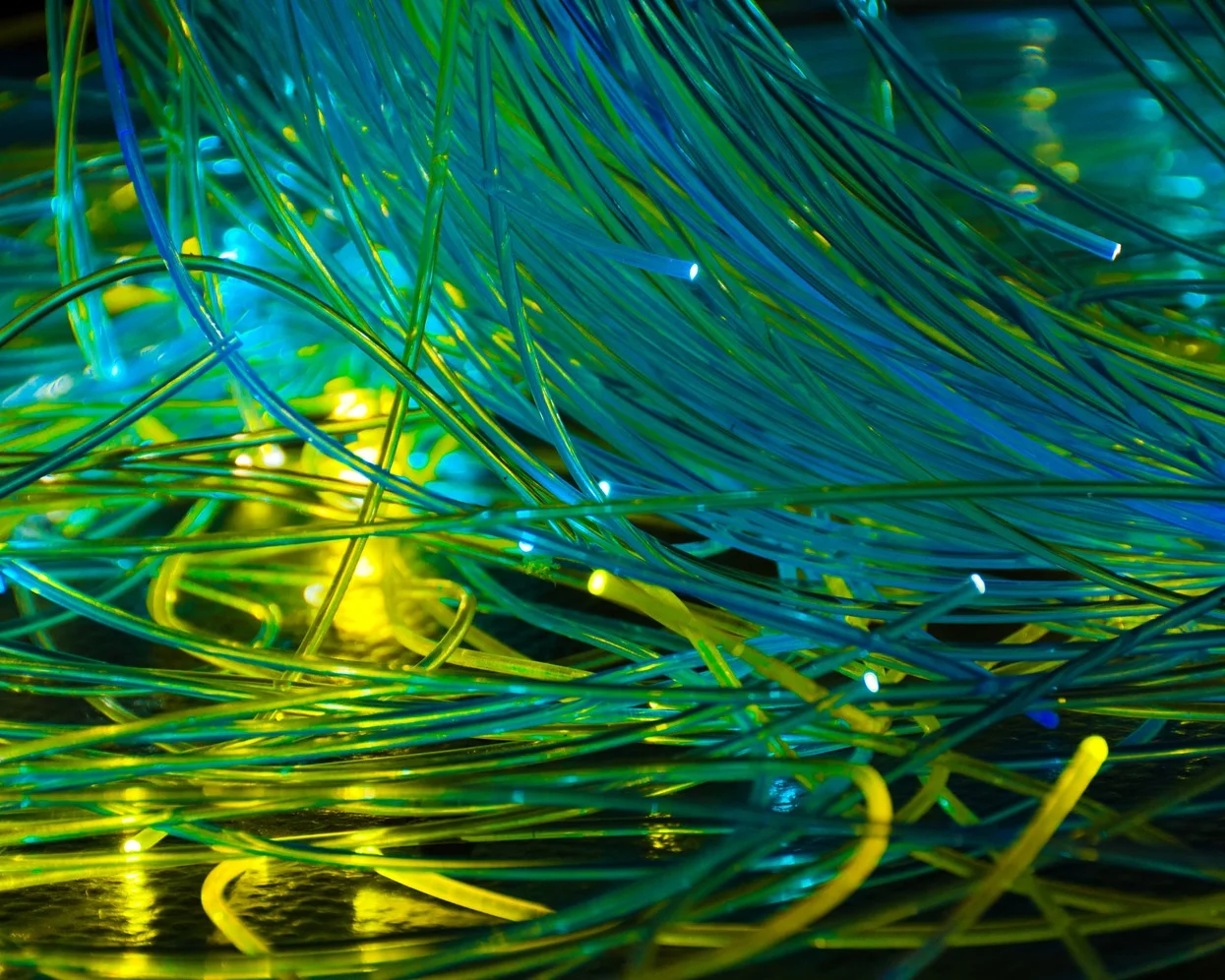
Filament Mind is a human information-driven installation designed to visualize the collective curiosities and questions of Teton County Library visitors through a dynamic and interactive spatial sculpture. Whenever any Wyoming public library visitor anywhere in the state performs a search of the library catalog from a computer, Filament Mind illuminates that search in a flash of color and light through glowing bundles of fiber optic cables. Each of the 1000 fiber optic cables hanging above (totaling over 5 miles of cable) corresponds to a call number in the Dewey Decimal System, which organizes the library’s collection into approximately 1000 categories of knowledge. These category titles are displayed in text on the lobby’s south and north walls at the termination points of the fiber optic cables.
Just as libraries throughout history have inscribed the names and words of great minds into stone, Teton County Library will visualize the thoughts of all its visitors through a living, visual archive of their questions. Filament Mind will literally be the mind of the library and, by extension, that of the community. Experiencing it, visitors will witness the transformation of individual questions and queries posed to the digital catalog, transmitted through synaptic firings of form, color, and light, into a display of emergent collective intelligence of unprecedented visual expression.
Filament Mind was made possible thanks to funding from the Teton County Library Friends and other private support.
Client: Teton County Library, Jackson, WY
Library Architect: Gilday Architects
Public Art Director: Carrie Geraci, Jackson Hole Public Art
Data Visualization Design: Noa Younse
General Contractor: GE Johnson Construction Company
Structural Engineer: Nelson Engineering
Electrical Engineer: ME Engineers Inc.
Tele-communications: Toolson Telephone Inc.
Electrician: Greiner Electric
Metal Fabrication: Elliott Specialty Metal
Fiber Optics and Illumination Equipment: Minar Illumination
Acrylic Text Fabrication: Shenzhen Ideas
Photography: David Agnello Photography
Videography: Eric Daft, Fisher Creative
Special thanks to: Larry B., Aaron C., Larry, Nick, Elsa, and Danielle for installation support.
Dynamic Performance of Nature (2011)
The Leonardo Museum, Salt Lake City, Utah with Yong Ju Lee and Noa Younse
Dynamic Performance of Nature is a permanent spatial media installation in the Leonardo Museum of Art, Science and Technology, located in Salt Lake City, Utah. DPoN engenders environmental perception in the museum’s visitors by communicating global environmental information through a dynamic and interactive interface embedded in the material of the wall. DPoN invites curious inquisition as well as detached contemplation of the synthesis of light, material, space, and global environmental information.
Environmental sensors capture data from sources throughout the planet and feed that data to solar-powered LEDs embedded in the sine-wave form made of recycled plastic. As the sensors register changes in temperature, wind, seismicity, and other factors, the LEDs reflect these fluctuations with continuous spectral waves that represent minute shifts in the data feed from moment to moment. At 92 feet long and over 14 feet high, DPoN covers 1300 sqft of vertical exhibition space traversing the museum’s ground floor lobby and acting as a programmatic threshold between exhibit spaces. It’s composed of 176 unique recycled HDPE fins embedded with 1,888 full-color RGB LED’s and held together by approximately 8000 individual set screws. We estimate the amount of plastic this project diverted from a landfill to be around three tons.
The color spectrum seen flowing through the wall reflects temperatures in the weather feed; the speed of color flow across the piece shows actual wind speed; the direction of color flow indicates the direction of the wind with cardinal directions oriented to the sides of the wall. When an earthquake registers with the USGS, a distorted world map on the wall displays the earthquake's location — the brighter the color and more frequent the lights flash, the stronger the quake. Visitors can interact with DPoN using Twitter to send messages to @LeoArtwall that either change the global weather feed or simply paint a wash of colors that dance and chase across the wall.
Voxel Cloud (2017)
The Pierce Building, San Jose, California
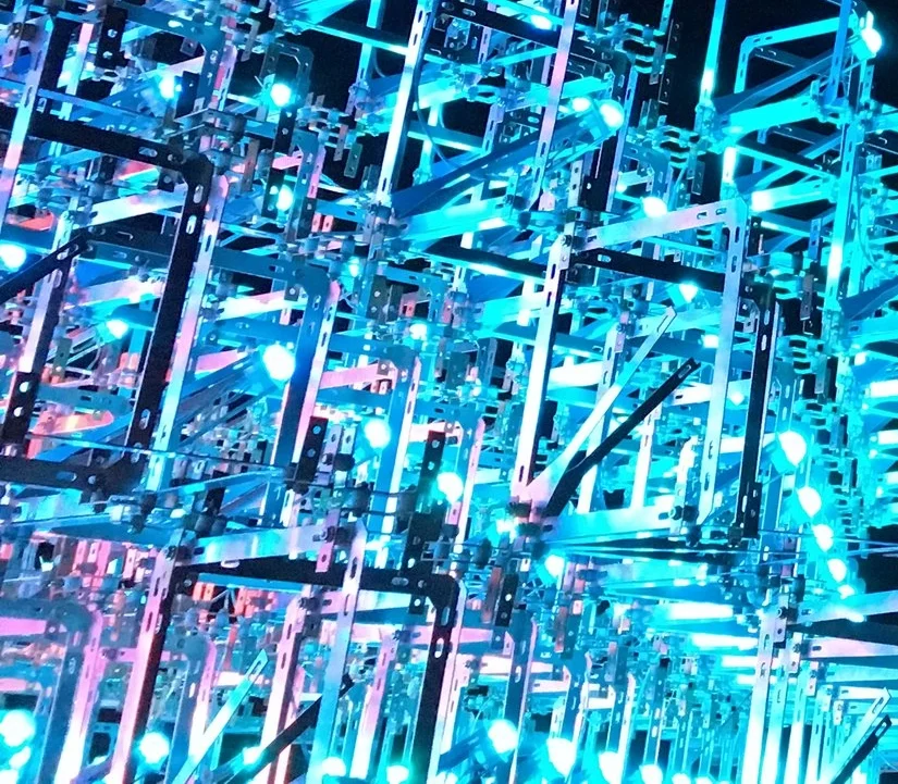
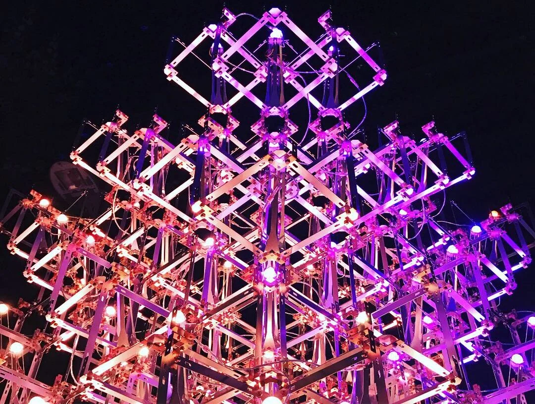
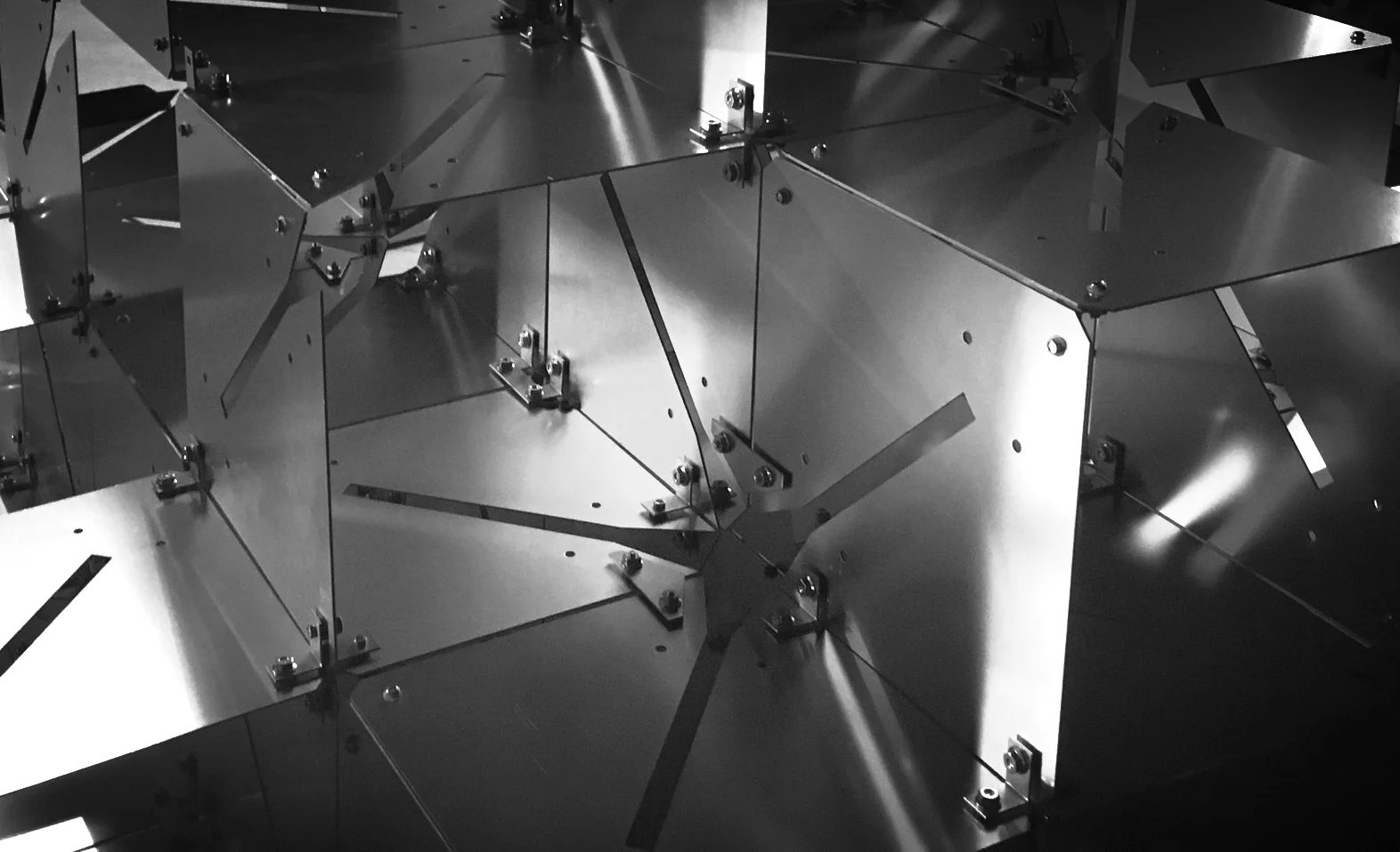
Voxel Cloud is a three-dimensional illumination texture designed to diffuse the Pierce roofline into the San Jose sky through a cloud of clustered light voxels draped atop the building. It is a dynamic illumination system composed of an array of data-driven RGB LED’s contained and connected through a matrix of reflective, metallic cube frames. Each frame is identical and when repeated in aggregate the collection generates a visually complex yet site-responsive structure capable of adapting to the building’s physical elements. The frames create a refractive medium through which the emitted light reflects, bounces, and travels, propagating multi-dimensional light through the city skyline.
As a singular composition of illuminated form Voxel Cloud is monumental and unique, capable of augmenting the San Jose skyline at the urban scale – a true civic landmark. Simultaneously its aggregate configuration of smaller units induces high resolution detail that makes it addressable to the scale of the building envelope and its textures. The reflective cube matrix also increases the resolution of light by multiplying thousands of light sources into tens of thousands of shimmering light points. The result is an atmospheric volume of scintillating light as opposed to a conventional and monolithic “display.” In this way Voxel Cloud engages light as a volumetric medium of spatial and experiential transformation and not simply a surficial application of illumination technology as a “screen.”
Resonance (2021)
Denver Performing Arts Complex, Denver, Colorado
Photos by From the Hip Photo
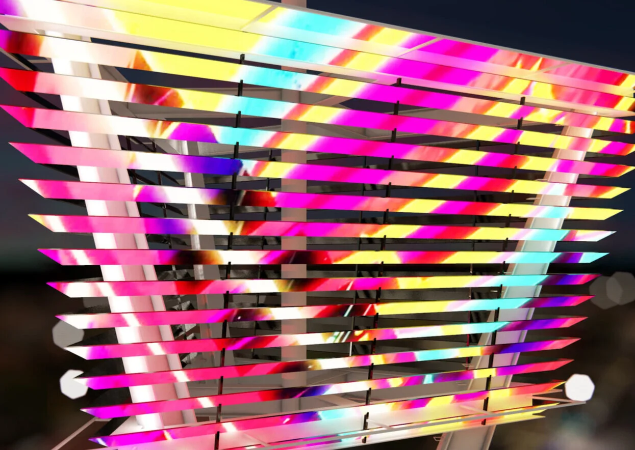
Resonance is a hybrid illumination sculpture composed of 300 powder-coated aluminum branching fans resembling a frozen sound wave of vertical lines similar to an equalizer or audio histogram.
The branching fans traverse the length of the Buell theatre façade facing Champa commons and its new public plaza.
“Resonance” is built on the concept of Doppler shift, which describes the change in frequency or wavelength of a wave from the viewpoint of an observer.
“Resonance” is based on the fascinating capability of Doppler effect to induce dynamic motion from stillness using patterns, waves, and interference to make stabile objects appear to move, accelerate, expand, extend, and dissolve.
“Resonance” is intended to convey the sonic energy flowing through the site which is created by the performance activity of musicians, actors, and the public. Resonance will be able to analyze the performances occurring in the various buildings in real time and use this audio data to control the color, motion, and luminosity of the lighting.
“Resonance” will take input from a handful of “singing points” distributed throughout the site where people can sing into an outdoor microphone which will visualize their auto-tuned voice and integrate it with the sound visualization from the performances.
From afar, the interlacing of vertical and rotated lines will create remarkable optical illusions such as moiré, mirage, and false transparency.
The lighting effects are tightly choreographed with the physical qualities of the piece in order to entice and inspire people to engage the project with their own creative imaginations.
Luminarc (2016)
Northeastern Junior College, Sterling, CO
Luminarc is a translucent polycarbonate "arch" that forms a gateway threshold to Northeastern Junior College's French Hall. At night Luminarc illuminates in multi-color LED light reflected and refracted from it's top surface.
OMI Rock (2013)
Omi International Arts Center, Ghent, NY
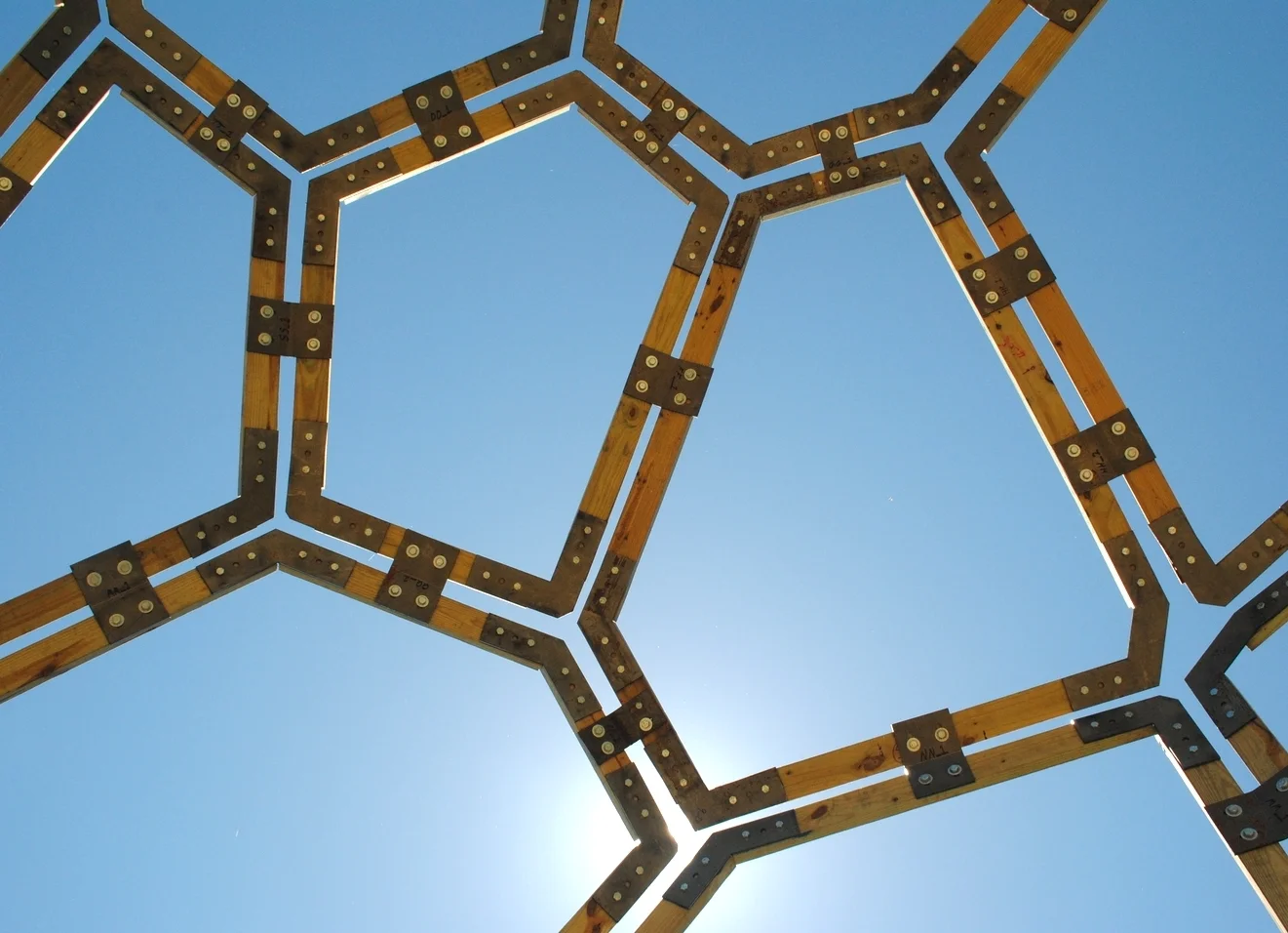
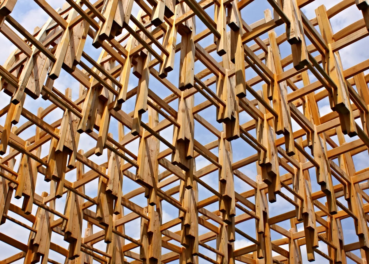
Omi Rock Pavilion is a large faceted structure situated on a hilltop overlooking panoramic views of the Catskill Mountains. Operating at the intersection of art and architecture, the Omi Rock is at once a formal gesture and a space-making structure that connects the experience of viewing and inhabiting the landscape simultaneously. The formal inspiration for the piece comes from the subsurface geology of the area - the rocky outcroppings scattered throughout Omi's campus that emerge from the ground. As a constructed rock outcropping, the pavilion plays with the question of what is natural and what is artificial, inverting buried geologic mass into a soaring wireframe skeleton. From afar, the pavilion appears as a drawing on the landscape, a tracing of the site’s invisible geology. From inside, the faceted wooden structure frames views of the landscape that make it appear as the artificial backdrop for a new nature the rock manifests.
Visitors are encouraged to sit in the pavilion, experiencing it both for its form as well as its function. The wooden facets that comprise the structure will cast changing shadows and striped patterns depending on the sunlight and time of day.
On view and open to the public daily at Omi International Arts Center
Steel fabrication: Elliott Specialty Metal
Wood and other materials: Mario's True Value
The Anti-Spectacle (2018)
Amazon Campus, Seattle WA
From deep in Silicon Valley on the skyline of San Jose, a rogue illuminated element has broken free from the media architecture spectacle Voxel Cloud. No longer constrained to its urban image-making host it has escaped north to Seattle seeking autonomy and authority in its own illuminated domain, hoping the sensible citizens of Seattle will give it recess from a life of iconicity. Floating above the Amazon plaza the Anti-Spectacle rests, breathes, and pulses with new life, free to illuminate its own world as it enjoys. But beware, should any would-be watcher seek its attention and venture too close to its autonomous territory, the Anti-Spectacle will enter a state of frenzy and FREEZE it’s dynamic display. Wanting neither scene nor sight, the anti-spectacle will only behave when its space and boundaries are respected, and its human neighbors seek only appreciative curiosity from a modest distance.
The Anti-Spectacle, the object of this proposal, is an approximately 6' x 6' x 6' cube matrix containing approximately 100 smaller anodized aluminum cubes, each cradling a color change LED. The design is a prototype material duplicate of my project Voxel Cloud, located on the roof of the Pierce Building, in San Jose California. The cubes are conceived as light voxels that create a spatial array in which material and light entangle to produce a scintillating illuminated body. Elements of this body precisely align in angled superposition to create visual effects such as foreshortening, doppler shift, and parallax, thereby stretching the viewer’s perception of the piece within the visual field. Viewed from different angles the light voxels appear to move, shift, and accelerate under the power of light as if attempting to escape the time and space of the present.
As mentioned in the longer narrative, the Anti-Spectacle will literally freeze illumination when people get too close to it. The intent of this reversed nature of interaction is to create a perceptive zone of absence in the audience, rather than an expected and consumptive fullness of effect which is typically created in illumination installations. It will do this by connecting a PIR motion sensor to a relay switch that will power on and off the DMX decoder instructing the LED’s on what color to produce. When no data is sent to the LED’s they freeze on their last color before the relay switch paused communication. This zone will be set by a distance radius of about 4 feet such that when people cross that threshold the lights instantaneously freeze until the spectator moves away from the work. Through the collective confusion this form of interaction creates it is my hope that the spectators will solve the puzzle and realize they must back away from the Anti-Spectacle. It will require patience. I also hope that spectators will further communicate this contingency to subsequent viewers as they approach until a sort of mythology and oral narrative is born and passed down from wave to wave of audience throughout the festival. Perhaps the only way to penetrate the trust of the Anti-Spectacle is through slow, cautious, careful movement, much as one approaches a wild deer in the woods, where "respectful" approach will enable one to slip past its defenses to achieve intimate contact.
The "Liberation of the Anti-Spectacle" grows out of recent readings in the philosophies of New Materialism and Object-Oriented Ontology which attempt to elevate the agency of objects and things independent of their instrumentalization by humans and their culture. The narrative above is obviously fictitious, but it has the possibility to illustrate a possible inner reality of the object and the mysterious latent potential within objects to exist autonomously, free from conscription to folly by human agenda. The proposal simultaneously critiques and embraces the prompt of light festivals by offering the opportunity for new understanding of the medium and context of interactive light art through a smart, if somewhat behaviorally perturbed, illumination artifact.
Lumigraph (2017)
Jack London District, Oakland, CA (unrealized)
Lumigraph is a drawing of light, or light field, intended to capture and convey the luminous energy flowing through and around the site of the Madison street underpass. The Jack London District is at an energized threshold in the historical and spatial evolution of downtown Oakland. As the area seeks to grow, enrich, and expand through new development and the life that it will bring, it must simultaneously reconnect the disjointed spaces and communities of the district while also reconciling the divisions structured into its urban fabric resulting from the bifurcation brought by the I-880 throughway. In light of this appeal I feel that any intervention in this urban space must be connective in nature, both experientially and visually, in order to draw people out, forward, across and ultimately together. This is the purpose of Lumigraph.
Situated just beneath the underpass ceiling, Lumigraph’s continuous suspended mesh of “woven” anodized aluminum closely hugs the full length of the ceiling, terminating at both ends by wrapping around the upper ceiling edges to face the overpass sides. It initially presents itself as a graphic, gateway marker facing Madison Street to the north and south on the side of the I-880 overpass. The marker appears as a hybrid graphic “landscape” of energized compositional field lines crossing and converging beneath a subtle mountain profile. These lines are angled and dynamic, flowing outwards and upwards through the mesh to convey the energetic, forward-moving shift of the Jack London area. Simultaneously these dynamic lines are anchored by and drawn down from the meandering natural profile which recalls the Oakland Hills, grounding the lines in a representation of nature and place. This is a deliberate abstraction of Oakland’s geographic and urban condition meant to allow the art to serve as a unique bridge marker for the greater downtown area viewed from afar.
Sensarc (2015)
Roosevelt High School, Washington D.C.
Sensarc is a shade structure and arcade wall that covers the patio seating area to the east of the autism classroom block at Roosevelt High School. It acts as a visual and audible buffer to the parking lot adjacent to the patio and contributes to the patio space’s overall quiet and relaxing atmosphere.
Prior to designing the piece, we consulted with an autism specialist who suggestd techniques to implement such as order, subtle and logical visual patterns, and things to avoid such as asymmetry, “noisy” elements in any sense, and abrupt changes. Our response was to create a sculptural “texture” composed of 1800 polycarbonate tubes that corbel to form a symmetrical, 3-bay archway that gently arcs and waves in and out of the patio space.
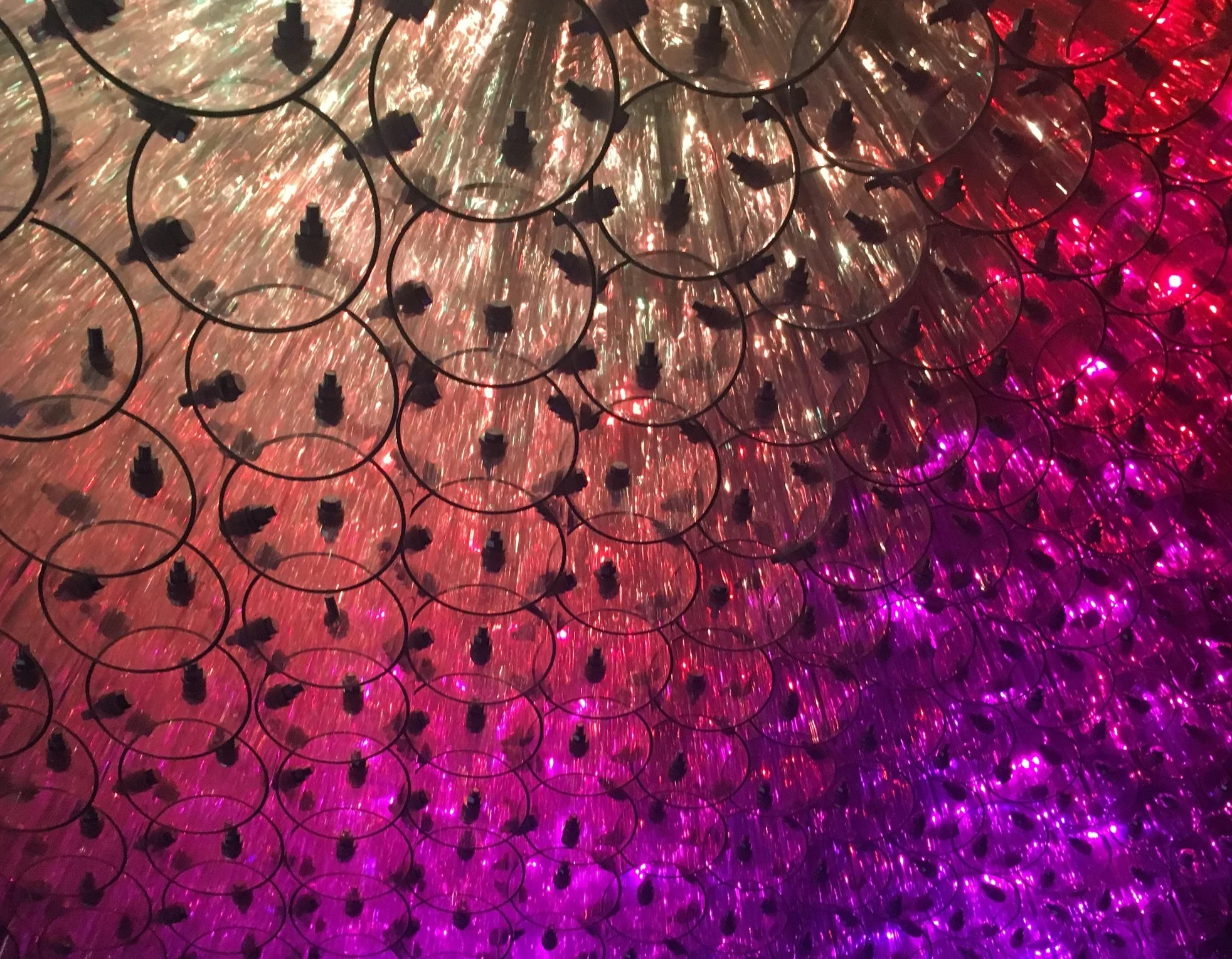
Upwards of 12,000 bolts stitch the tubes together which are all of unique length. What this multiplicity of material provided was something with continuous differentiation, rather than abrupt change, an opportunity for “mathematical” exploration of the piece in terms of counting, geometry, and algebra, and clearly delineated structural order. Incidentally the transparent quality of the tubes, when viewed from below, creates a unique circumscribing of circles and arcs from the opaque bottom edges of tubes which appear to overlap.
Additional Photos coming soon...
Client: Department of General Services, Washington D.C.
School Architect: Perkins Eastman DC
Public Art Director: Sandy Bellamy, Department of General Services
Project Management: McKissack & McKissack
General Contractor: Smoot/Gilbane
Structural Engineer: Silman
Metal Fabrication: Crystal Metalworks
Miscellaneous Metals: S.A. Halac Ironworks
Footing Installation: Harrington Contractors Inc.
Plastic Fabrication: Hengge Products
Installation Team: Alexandre Beaudouin-Mackay, Lisa Chow, Katie Lee, Amy Oliver, Jesse Rafeiro, Vanessa Vuibert
OMNI (2022)
Florida Gulf Coast University, Fort Myers, Florida
Photos by James J. Greco
Aggregation (2016)
RTD Fox St. Station, Denver, Colorado
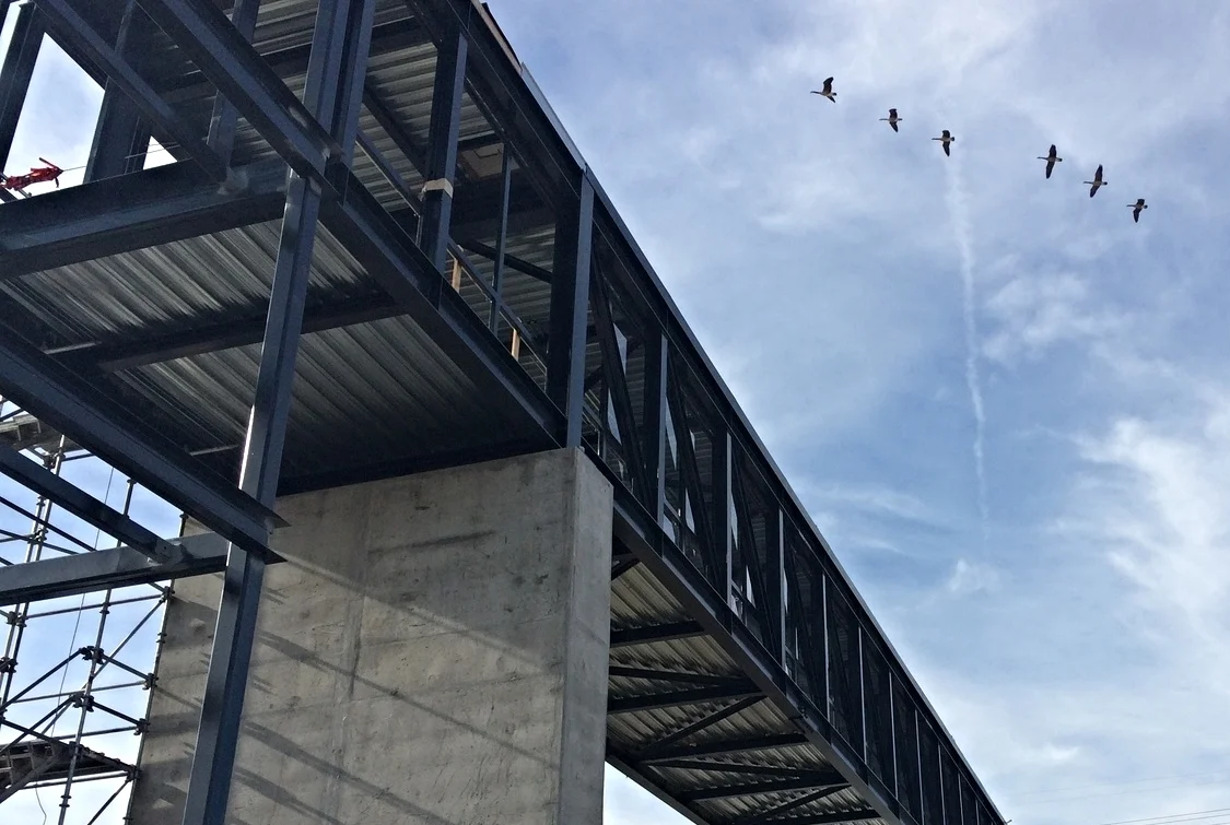
Aggregation is an anodized aluminum matrix structure that interprets visual cues from the surrounding landscape to produce a dynamic and technical yet symbolically familiar mountainous city skyline that adds to the image identity of the city of Denver. Located along the Gold Line light rail branch.
Sonarc (2020)
Duke Energy Center for the Performing Arts
Raleigh, North Carolina
Photos by Tzu Chen and Brian W Brush
Sonarc is an illumination sculpture composed of twelve hundred 5 inch diameter clear polycarbonate tubes arranged in a hexagonal honeycomb grid.
The tubes form along a 30 foot by 30 foot arcade that opens towards the center parking garage, the Residence Inn, and the downtown. Positioned like a pair of outstretched arms, Sonarc welcomes visitors to Duke Energy Center for a pre-show experience.
Visible from all around Duke Energy Center plaza, Sonarc is designed to be an uplifting formal complement to the rhythmic elements of the classical façade and reflect the contemporary materiality of the modern addition.
Sonarc is positioned across from the Acorn to create a unique visual dialogue which is complementary but preserves each work’s autonomy. The result is a spatial connection which raises the visibility and stature of each through a unified public space.
Approximately 800 full color LEDs illuminate Sonarc, capable of fully customizable light display. The lights will be publicly interactive. Visitors can approach what I call the “singing” point where they can sing into a microphone connected to a device which will analyze their vocal frequency and change the colored waveform of the lighting in response. Simultaneously, a speaker system embedded at the “singing point” will playback an autotuned correction of their voice to the closest musical note. The effect will connect visitors visually and audibly to the piece and bring them closer to the colorful experience of “performance” at Duke Energy Center for the Performing Arts.
Expedia Campus (2019)
Unbuilt, 2019
Mood Map (2013)
Seoul National University Museum of Art, Korea with Yong Ju Lee and Noa Younse
Mood map visualizes the moods of Korean people in color and light through textual analysis of their Tweets on Twitter. A custom software program in Processing searches and analyzes Tweets in Korean language through the Twitter API. Tweets are analyzed using a text analysis library that searches for specific strings of Korean characters that describe certain moods or feelings.
There are six main categories of feelings or moods visualized: joy/pride, love, fear/ shame, anger, pity, and sadness/frustration. Mood Map cycles through three visualization sequences. The first sequence displays occurrences of tweets in real time. The second sequence shows collective data of two moods over the past one hour. And the third shows collective data of one mood in a day. This sequence controls the intensity of color associated with each mood/feeling. The six mood/feeling categories are associated with six fiber optic illuminators, each with a specific color. Each illuminator is paired to two other illuminators through the connection of fiber optic cables. So as the intensity of certain moods changes over time, visitors can witness the relative expression of all the moods compared to each other, changing dynamically over time every 30 seconds. The overall composition will express a flux of mood, feeling, intensity and time transmitted to a three dimensional spatial body.
Mood map was built and exhibited for the “Data Curation” exhibit at the Seoul National University Museum of Art.
Visualization: Noa Younse
Assembly team: KwangYeon Cho, Kibum Park, Young-Won Chi, Byunghwa Kim, Min Jae Lee, Sang Ki Nam, Daram Park, Sooyoung Park, HyunWoo Yoo
Seat (2012)
Freedom Park, Atlanta, Georgia with Yong Ju Lee
Sitting is perhaps the most common condition from which we experience architecture. Whether we work, relax, watch, eat, sleep, or talk to each other, sitting is at the core of our relationship to buildings. Sitting enables the detached observation of our lives in space and time, whether it’s to look upon the buildings we inhabit, or look out from them, towards the cultural milieu that surrounds.
SEAT is composed of approximately 300 simple wooden chairs arrayed and stacked in a sine wave surface drawn into an agitated vortex rising from the ground. It formalizes the transformation of chairs from detached useable objects into structural and spatial components of an ambiguously occupiable edifice. It’s intended to be legible and readable as a collection of individual seats, but when approached, visitors perceive the transformation of the chairs from domestic artifacts to structural units within a system.
The structure is zoned by rotational differentiation in groups. Chairs around the immediate periphery are rotated for outward observation of the city and the surrounding neighborhood. At the base of the vortex, chairs turn inward to create an intimate, compressive space for visitors to converse and regard the upward flow of chairs transcending their function. The chairs are additively assembled through a modified “corbelling” process achieved by sequentially attaching chairs beginning at the edges and corners working towards the center. Columns are used in strategic locations for additional support.
Client: Flux Projects
Assembly team: Rudi Matheis-Brown, Tom Roncco, Kyle Holland, Larissa Hand, David Williams, Britni Jeziorski, Megan Mallery, Katie Seifert, Wendy Chou, Kayla Kirchberg, Sarah Turner, Emily Gilbert, Colleen Devoe, Casey Butler, Cydne Mayberry, Maria Lioy, Sydney Styles.
Liquid Light (2013)
Herradura Barrel Art Program, New York, NY with Amy Oliver
Tequila is a spirit born from the light of the sun. Waves and rays of flowing energy travelled millions of miles, gathered and pooled into glowing fluid magic. Herradura harnesses this magic, weaving it with the colors and textures of the earth into incomparable molten flavor.
The barrel catalyzes this transformation over time, pumping heat, aroma, and essence into the luminous fluid before releasing it for the world to enjoy. Our project celebrates this moment of transformation, freezing it at the speed of light, as energy, power and color, burst from the barrel into a stream of chromatic energy.
Photography: Peter Katz
Steel Fabrication: Elliott Specialty Metal
Cirrus and Stratus (2019)
Coolidge High School
Washington, DC
Photos by Tzu Chen
High School is a remarkable time defined by bold new beginnings and brave conclusions, much like the rising and setting of the sun. With each day, week, month, and each year, we all get a new chance to rise up, take flight, and soar as the people we want to be or who we want to become. Together, like a flock of birds, we take shape as something greater than any one of us are alone. And like a cloud billowing on the horizon and bathed in golden light, our lives are swollen with possibility basking in the glow of what the future holds …
For my proposal for the Coolidge high School atrium it’s this spirit of dawning, rising, soaring, and working together for a common purpose that I wanted to convey with my artwork.
For the north and south Atrium I’ve imagined a pair of twin clouds – “Cirrus and Stratus” – that gently float above the horizon of the atrium and illuminate with the colors of the sunset, sunrise, and the sky. Each cloud is unique but together forms an interlocking whole, like a beating heart at the center of the school community.
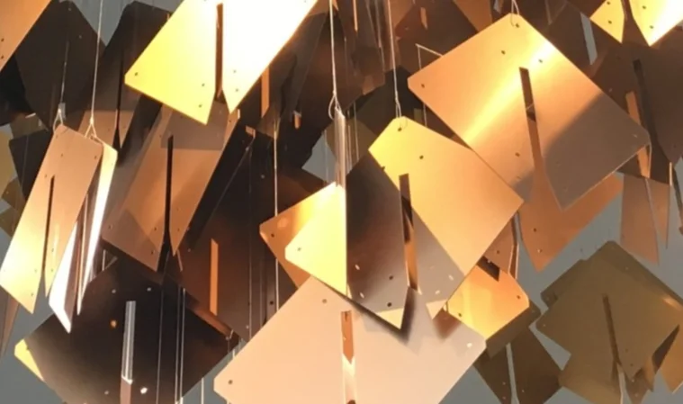
Each cloud is made of approximately 600 pieces that resemble winged “birds”, circling and flowing in unison to form a collective, emergent pattern. These birds are made of lightweight, recycled aluminum harvested from the discarded pieces from the fabrication of my project Voxel Cloud.
The “birds” are suspended by ultra-thin steel cable that’s barely visible from a unique web-like painted steel lattice connected to the ceiling structure. The suspension web symbolizes the interconnectivity of all life, and the community of friends, family, peers, mentors, teachers, and neighbors which holds life in balance.
The colors of Cirrus and Stratus form in layers, moving from a deep purple through energetic red and orange to a glowing sunlit yellow for Cirrus, and a deep blue to a vibrant green in Stratus. These colors symbolize the promise of new beginnings and the subsequent collection and emergence of knowledge students will experience during their time at Calvin Coolidge high school.
The “birds” are free to move and sway delicately in the space. At different times of day, color and light will reflect differently with constant shifts of position and shade of color. This is why I’ve chosen to use a solid colored piece. Transparency of glass tends to muddy color and can wash out and disappear in different ambient light conditions. These anodized aluminum birds will always be bright and vibrant from any angle. They will also cast a remarkable dynamic shadow play on the floor of the atrium below.
The piece requires almost no maintenance aside from a rare dusting every couple years. Similar to my previous projects “Reef” and “Growth,” which use the same suspended mobile technique, Cirrus and Stratus will be elegant, noble, vibrant, and most importantly inspiring additions at the heart of Calvin Coolidge high School.
Microcosm (2013)
Unbuilt, 2013
Microcosm is an unrealized proposal for an interactive permanent public art installation in a prominent science museum. It is inspired by numerous phenomenon in the universe including the formation and composition of galaxies, logarithmic mathematics, quantum mechanics, string theory, swarm behavior, and the holographic principle. It is composed of 3,141 "voxels" that combine to form a 3-dimensional information display that is simultaneously cubic, triangular, tetrahedral, and hexagonal. It reconciles, both formally and conceptually, the rational geometric primitive with the non-linear, indeterminate, and algorithmic, or, the ideal with the actual.
Visualization: RVARQ Nicolas Wehncke
Huntington Beach Pier (2022)
Unbuilt, 2021
Imaginal (2015)
RTD Fox St. Station, Denver, Colorado
Unbuilt proposal
Reef (2017)
Olympic Towne Center, Gig Harbor, Washington
“Reef” is composed of 300 identical pieces of anodized aluminum arranged three-dimensionally in space to create a porous wave-like volume, abstractly resembling the watery terrain of an ocean reef. It takes its name, and its inspiration, from ocean reefs which are characteristically the most biodiverse ecologies of the ocean and the cradles of ocean life. It is the intent of the artwork to convey the energy, complexity, and beauty of an ocean reef as a symbol of the life that will thrive at the heart of the Olympic Towne Center.
“Reef” speaks directly to Olympic Towne Center’s focus on sustainability and environmental awareness. All of the anodized aluminum pieces are recycled, non-virgin material recovered from the waste cuts of another project. This means that no additional raw material was used to create “Reef’s” primarily artwork material and “Reef” diverts material that would have either gone to a landfill or reprocessed using high-energy manufacturing methods. It’s a perfect example of re-purposing and reusing with zero waste and extra energy.
“Reef” appears both as a gentle waveform and as a dynamic, spiraling fluid volume, balanced uniquely between abstraction and legible symbol of an ocean phenomenon. Besides its overall shape, the material properties of “Reef’s” anodized aluminum also make the piece alive with light and color just like the ocean. The pieces of “Reef” will be anodized along a color gradient from a bright silver to a vibrant cerulean blue. This coloration gives the effect of the change in light as the depth of water increases, the lighter shades at the top and the darker blue at the bottom. This gradient also lends an effect of visual lengthening of the space itself as the stretching color makes the artwork, and the atrium, feel even taller.
Furthermore, anodized aluminum creates a particular type of reflection called “diffuse” reflection which means that incident light and color reflect off of the aluminum in a scattering pattern, sending soft, subtle color reflections in all directions, never harshly. This means “Reef” will not only show its deep anodized coloration but will also blend and display the soft reflections of color of the materials, signs, light, and people around it. So just as a natural reef is a material body of its own, it also contains and shows the colors of all the life within and around it. “Reef” will change with the quality and intensity of incoming light and because of its diffuse reflection it will never blind anyone or create direct reflections of sunlight.
Regarding some technical details, “Reef” builds on a technique of suspended mobile artwork that I have developed through a number of other artworks that is efficient, special, and beautiful. “Reef” is able to achieve a specific shape by being suspended from a custom lasercut steel mesh (a work of art in its own right) which controls the location of the attachment points for the thin cables suspending the aluminum pieces. The mesh is suspended by very few points connected to the ceiling structure of the atrium and can connect using a variety of fastening systems such as threaded rods or beam clamps. The overall weight of “Reef” is a mere 500lbs maximum. The anodized aluminum pieces are suspended by stainless steel aircraft cable that is super strong and barely visible with a diameter of .031 inches.
Because “Reef” is composed of many pieces arranged in space it also has a sound dampening effect which will work to reduce the harsh echoes and reverberations from the noises people make. Atriums with their hard glass surfaces, rectangular volumes, and high ceilings can often amplify speech and other noises to the annoyance of others. Filling that space with many reflective surfaces the way “Reef” does reduces unwanted echoes better than a single object would.
“Reef” is an uplifting and inspiring work of public art perfectly crafted for Olympic Towne Center. Its complexity and subtle abstraction captures the imagination of people of all ages, giving them pause to gaze up and ponder its meaning and admire its beauty. Its message of sustainability by reusing materials which may otherwise seem useless will resonate with the ethos of its home in Gig Harbor and the greater Pacific Northwest.
Video produced by Bayside Entertainment, LLC
Leaven (2018)
Stadium Boulevard, Ann Arbor MI
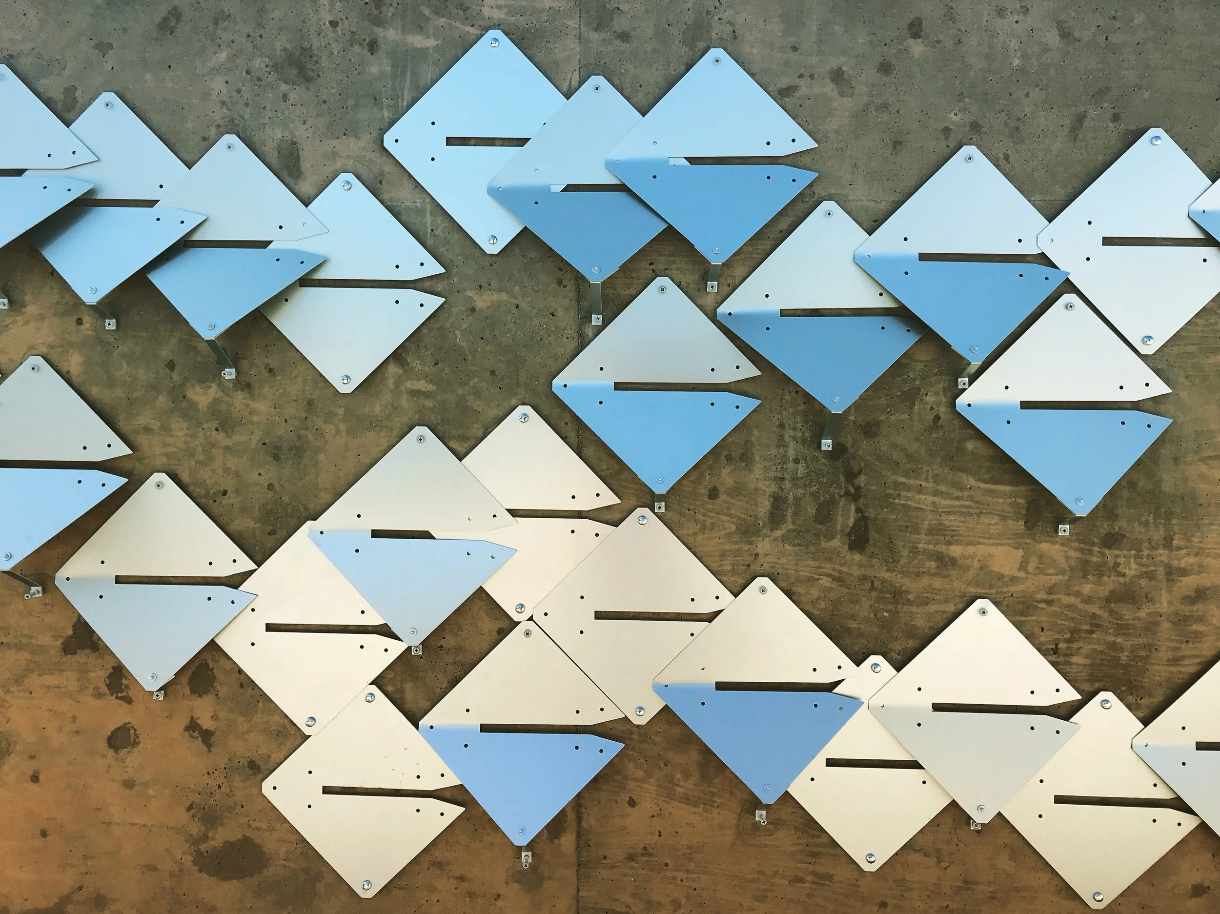
LEAVEN is a faceted, vine-like relief sculpture that mimics and magnifies the adjacent natural elements native to the southern side of East Stadium Blvd. Taking cues from the repetition of stones and leaves, and the branches that pattern the site’s verdant edge, LEAVEN will visually soften the hard boundary of the new concrete retaining wall by creating ‘windows’ to nature with flowing tendrils of reflective aluminum ‘leaves’ nestled in the recessed pockets of the wall. The myriad reflections on the aluminum ‘leaves’ intend to embody Ann Arbor's many colors at different times of the day and year, while also mediating the contrast between the surrounding natural material and the built environment.
LEAVEN’s aluminum ‘leaves’, each a 9”x9” square rotated in a “diamond” orientation, are anodized to create diffuse reflections of light that will translate the movement of clouds, the sky, leaves and trees, and the various colors of cars and people that pass by. The reflections are achieved by folding the bottom half of each ‘leaf’ upwards according to three distinct angles. Each angle corresponds to the distance the leaf bottom protrudes from the recessed wall surface. A 1”, 2”, or 3” bend is utilized to control these angles ensuring that no leaves extend beyond the 3” recess in the wall. This limits the potential for catching or snagging by any pedestrians. The bend angles within that range can be varied randomly or according to a specific visual pattern integrated with the overall composition.
As its primary material, LEAVEN utilizes anodized aluminum for its ability to create soft and diffused reflections of its surroundings. The ‘leaves’ will create subtle gradients of color by blurring the surrounding context of city, trees, and people. This effect will be especially spectacular when moving past the wall at fast speeds such as from a car or bicycle. The quick changes in viewpoint will create the illusion of rustling leaves and flowing shifts of color. This effect can be seen to a limited extent in the accompanying time-lapse video submitted with the proposal.
The organization and distribution of the ‘leaves’ throughout the wall recesses is inspired by the flowing stacks of stones that construct the stone wall located on site. Although the stones are self-similar units, their arrangement produces an irregular yet continuous ‘branching’ pattern where stones appear to follow invisible curvilinear lines that converge and bifurcate. LEAVEN duplicates this logic of flow lines by arranging the ‘leaves’ in a continuously changing, overlapping sequence that is smooth yet variable as it meanders the length of the wall. The invisible ordering ‘branches’ rise, fall, sweep, and sway guiding the placement of ‘leaves’ in a visually dynamic form. This curving, dynamic, flow contributes to LEAVEN’s energetic appearance to viewers on foot and in cars.
Aluminum is one of the lightest structural metals so it can easily be folded into position at the specified increments. This can be done before mounting the ‘leaves’ onto the wall or during installation for maximum compositional flexibility. The ‘leaves’ will be mounted according to a removable/disposable paper template placed on the wall recess surfaces and anchored using simple concrete screws or anchors that could be pre-drilled if necessary. The template also allows for adjustments to be made on site to allow the ‘leaves’ to reflect the most desirable visual conditions. Most anchors will be hidden from view in the folds of the ‘leaves’ and those that support the lower folded-up sides of the ‘leaves’ will be encased in hollow aluminum standoff spacers to preserve the clean visual sophistication of the piece. With a high heat–capacity, the aluminum ‘leaves’ will not absorb or release heat that can burn passersby and anodized aluminum is also very durable, so it will not rust or stain the concrete wall. As such the material should be safe, secure, long-lasting, and easy to maintain while providing amazing artistic quality.
LEAVEN is designed to maximize the visual character of East Stadium Boulevard as it transitions from a wild, natural threshold to a formal, developed boundary. Although this change will be abrupt it can be most effectively and beautifully softened with a nature-inspired artwork that recalls natural materials and textures yet abstracts them through light, shape, and form in a way that augments the site’s evolution as a developing place. Having visited the site myself, I see this change as a unique opportunity to create an artwork that will preserve the inherent character of that natural threshold with the very same materials that will lend it a fresh new look and lighten, uplift, and activate the entire East Stadium Boulevard streetscape.
Ecotonal (2019)
Maury Elementary School
Washington, DC
Photos by Tzu Chen
The central concept of “Ecotone” is a transition area between two biomes...where two communities meet and integrate.
The concept is a direct response to the RFP’s call for artworks that help to mediate the lobby, great room, and monumental stair, and that address the themes of Ecosystems, community, biomes, and the relationship between canopy and floor – which to me meant vertical integration.
The notion of verticality as an integrating quality also brought to mind the idea of a hanging garden, which places plant life at upper levels of a space or building which can then spill over and drape over spaces below. Hanging gardens are vertical transitions. So the combination of the ecotone and the hanging garden forms the foundation of my proposal, Ecotonal.
For Ecotonal, it’s the vertical integration of natural and artificial, floor and ceiling, and digital and physical mediums in space that guides the artwork’s composition as a unifying element within the space. I accomplish this through a single suspended mobile sculpture imagined as a tropical hanging garden to match the theme of the first floor. “Floral” colors from other school biomes highlight throughout the piece. All of the pieces are made of 100% recycled material as salvaged offcuts from a previous project, Voxel Cloud. No new material will be manufactured for this piece.
The artwork’s chromatic gradient matches directly to the colors spanning the first floor and second floor, between Tropical and Temperate. In this way the piece is an artificial ecotone itself, blending between two spatial biomes within the school, vertically.
In plan view, the artwork follows the unique curves of the floor platform and ramp, gently bending around the platform to further define the space, rather than occupy it. The position can be shifted as needed from what is shown here. The piece rests with 10’ clear height above the platform surface and areas where the leaves and flowers hang lowest are positioned over the lowest areas beneath.
As you can see, Ecotonal behaves as a spatial ecotone between the new and old buildings converging in the lobby. It has a softening, blending effect between new and old, brick and wood. Depending on the vantage point, Ecotonal’s form changes, appearing smaller from the upper stair landing and wider from the ramp coming from the old building.
The anodized aluminum material possesses a unique diffuse reflective property. This allows the leaves to gather and reflect soft light from neighboring pieces making subtle combinations within the spectrum.
The colorful leaves are not the only artwork element of the piece. Above the colored leaves is a custom suspension mesh, which precisely locates the position to hang the leaves using ultra-thin steel wire rope. This element is an artwork unto itself, and easily integrates with the overall concept as it resembles a natural web of relations consistent with concepts of ecosystems.
Beacon of Odessa (2017)
Cloth World, Odessa, TX (unrealized)
The Cloth World sign presents an opportunity to revitalize an existing and important cultural symbol with a hybrid illumination artwork that will honor Odessa’s design heritage while energizing a beloved artifact with new life. It will remain, as it has been, a signifying threshold and place-making monument with not only a rich past but a bright new future combining meaning and significance for those who’ve known it with inspiration for what it could be..
Episodic (2015)
Beit Ha'ir Museum, Tel Aviv, Israel
Unbuilt Proposal
Artist’s conceptual notes...
The Mind
Neural Network
Synapse > Firing
Translation of Metaphor
Foresigh/Hindsight > Memory > EPISODIC Memory
Memory as projected image superimposed with the abstract formation
and illumination of potential futures...
Function of media architecture in formation of collective urban memory...
Instantaneously linking past and future...self-reflective image of the city
and for the city...
Reading and re-reading signatures of the past in order to formulate the
future...
Taking historical imagery and analyzing congruent structures between
past and present as future construct...
Hearst Cloud (2015)
Hearst Elementary School, Washington D.C.
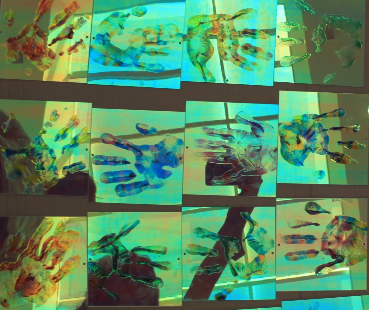
Hearst Cloud is a suspended mobile artwork composed of approximately 400 iridescent plastic squares arranged in a cloud formation which are painted with student handprints using stained glass paint. It’s intended to be a tangible representation of the student body - a physical signature of the school in place and time. Hearst cloud floats gently within the East Lobby space, reflecting and refracting colorful light and casting color across the adjacent walls and floors. The result is a departure from the usual tech/media-enriched artifacts for an elementary school more interested in simple representations than complex data visualization. Still, the 400 dichroic handprints manage to create a pixelated effect when viewed in aggregate.
Client: Department of General Services, Washington D.C.
School Architect: R. McGhee & Associates
Public Art Director: Sandy Bellamy, Department of General Services
Project Management: McKissack & McKissack
General Contractor: McCory Construction Company
Metal Fabrication: K-Form
Plastic Fabrication: Mechanical Plastics
Installation Team: Alexandre Beaudouin-Mackay, Lisa Chow, Kathi Hendrick
Grotto (2015)
RTD Station, Westminster, Colorado (Unrealized)
Grotto is designed to resemble an inverted mountainous or subterranean landscape with ridges, peaks, and valleys as a sliced tomography viewed obliquely from below. LED lighting is embedded within the tomographic slices.
Illustrations (ongoing)
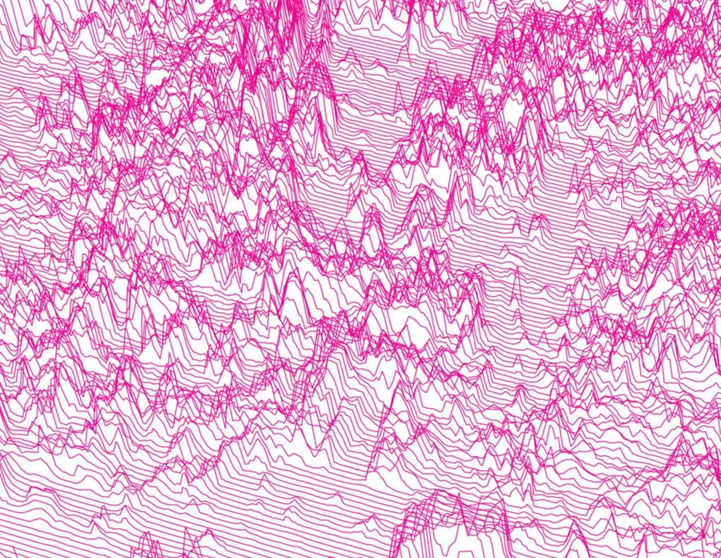
2D original visual artworks in pen and ink exploring virtual cartographies and geometric landscapes.
Softshelf (2009)
Exhibited at the 2009 Salone Internazionale del Mobile, Milan, Italy
With Yong Ju Lee
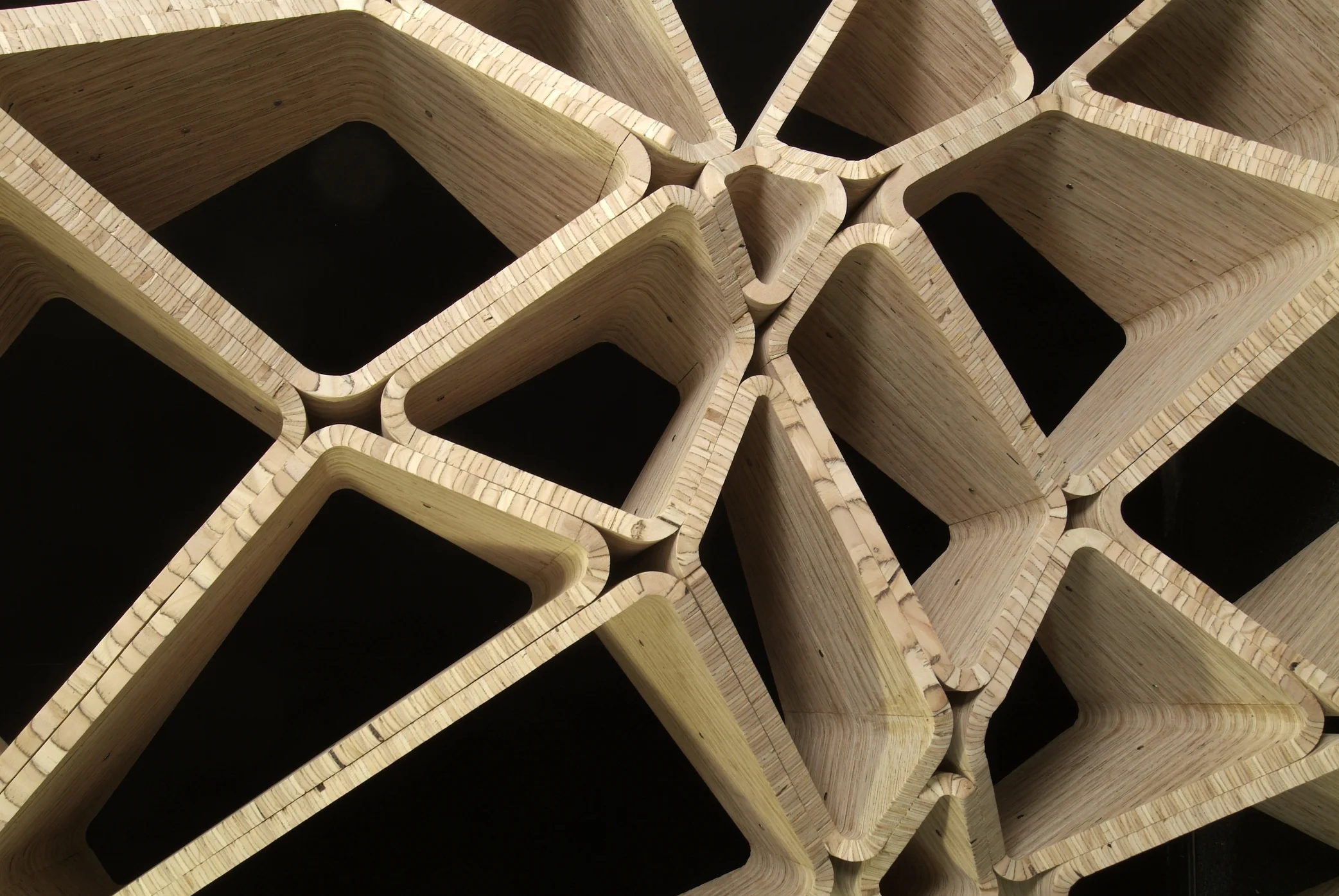
Softshelf is inspired by the idea of creating a bookshelf that deforms the rational cellular grid in order to create a custom occupiable, differentiated, and soft space for the storage of books and other objects. It is fully customizable by manipulating five customer controls embedded in a parametric design system: overall size of the shelf, overall geometric effect of the shrinking and expanding of boxes, the strength of this geometric effect on the entire shelf system, the curvature shape of the shelf, and the stretched shape of the boxes. Softshelf takes advantage of the rigidity and fluidity of wood combined with the precision of CNC milling technology to create a monolithic and continuous form, sturdy yet geometrically complex, and ultimately innovative.
Special Mention Rima Editrice Young & Design Compeition, 2009 Salone
Internazionale del Mobile, Milan, Italy
Featured on NBC's the Today Show in Today Throws a Wedding 2010
Growth (2016)
The Pierce Lobby, San Jose, CA
Growth is a permanent sculptural mobile artwork at The Pierce Building that’s an aggregate of anodized aluminum pieces suspended in space to resemble a three-dimensional tree in dialogue with an outdoor tree sculpture previously installed. It creates a reflective light source for the lobby space and anchors the social gathering area for residents and visitors.
Photos by Scott DuBose
Mountain (2015)
Unbuilt, 2015
"The beauty and charm of the wilderness are his for the
asking, for the edges of the wilderness lie close beside
the beaten roads of the present travel."
Roosevelt High School, Washington D.C.
